Viewing entries in
New York

The Inside-Out Diorama

Comment

The Inside-Out Diorama

THE NEW CRITERION, June 2023

The inside-out diorama

On the new Richard Gilder Center at the American Museum of Natural History.

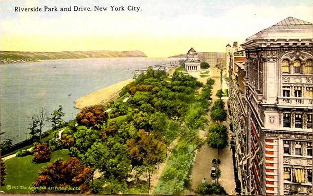
Anyone who has walked through the American Museum of Natural History might have sensed something was wrong. Just go through its Hall of Gems and Minerals, or its Hall of South American Peoples, or its Hall of Pacific Peoples. At the end of each of these long rooms, which were only reached through other long rooms, you found nothing less than a dead end. In a way, the reason was by design: the master plan of this museum, founded in 1869 and first envisioned by Calvert Vaux and Jacob Wrey Mould in 1872, has never been fully realized. Much like the Metropolitan Museum of Art, the Brooklyn Museum, and other grand nineteenth-century American edifices, New York’s natural-history museum was laid out on a massive cross-in-square plan, which has only been partially built out over time.

Beyond merely the dead ends, what this means is that, over a century and a half after its founding, the street-facing façades and infill architecture of this museum have been created in a progression of styles that have reflected, for better and worse, the ideals of their times. The museum began on the southern side of its four-block quadrangle bordering Central Park, carved out of the street grid of the then-undeveloped Upper West Side. From 1874 to 1877, Vaux and Mould extended their pastoral vision from Central Park to break ground on the museum’s first wing in the Gothic Revival style; from then until now, this building, which was soon surrounded by future construction, has housed the museum’s Northwest Coast Hall.

An aerial view of the American Museum of Natural History’s campus. Photo: Iwan Baan.

The plan to extend this Gothic language across the four seven-hundred-and-forty-foot sides of the envisioned museum was quickly eclipsed by changing architectural taste. In 1897, a new plan emerged to complete the museum in a Romanesque Revival style. The Seventy-seventh Street façade, designed by Cady, Berg & See and constructed between 1890 and 1900, and the southwest wing, designed by Charles Volz and built between 1906 and 1908, gave the museum its fanciful red turrets and first distinctive appearance.

The need for natural light and air at one time called for four internal open courtyards located within the circulating wings, all radiating out from a domed central tower. In the twentieth century, with advances in artificial light and ventilation, these open spaces began to be modified and built in. Rather than a dome, the central building became the museum’s lecture hall, designed by Cady, Berg & See in 1900. Wings for ocean life and education filled in the southwest and southeast courtyards in 1924 and 1928. A power and service building of 1930–35 infilled the northwest courtyard. Meanwhile the art-deco Hayden Planetarium, designed by Trowbridge & Livingston, was constructed in the northeast courtyard in 1934–35. At the same time, between 1931 and 1936, the museum’s eastern façade fronting Central Park West received John Russell Pope’s Roman Revival grand vision for the Theodore Roosevelt Memorial Rotunda, complete with a triumphal arch, coffered vaulted interiors, and an equestrian statue of our twenty-sixth president mounted at the center of a monumental entry plaza. Then, over half a century later, a year-2000 addition by Polshek Partnership, which replaced the Hayden with the Rose Center for Earth & Space, stayed within this original master plan while again departing in style, this time resulting in a celestial sphere (housing the new planetarium theater) suspended in an illuminated glass cube.

Despite over a century and a half, and the construction of some twenty-five buildings, the museum has still only filled out about two-thirds of its original master-plan footprint. This incompleteness has been most felt on its western side facing Columbus Avenue, where existing wings have ended abruptly, resulting in many of those back-tracking dead ends. A central building that connects these wings, on all four of the museum’s floors, has long been overdue.

The Columbus Avenue entrance to the Richard Gilder Center for Science, Education, and Innovation. Photo: Alvaro Keding / © AMNH.

The Richard Gilder Center for Science, Education, and Innovation, over a decade in the making and opened to the public on May 4, set out to do just that. (For more, see “Old museums, new tricks” in The New Criterion of February 2017.) Filling in a void along the museum’s western edge, the 230,000-square-foot wing creates some thirty new access points to the museum’s twenty-building complex. It also generally continues the massing of the original master plan while extending the museum’s central axis west from the Roosevelt Rotunda, resulting in a new façade that now lines up with Seventy-ninth Street.

Funded by one of New York’s great latter-day philanthropists, the Gilder Center is named for the late Republican financier who once teamed up with none other than George Soros to found the Central Park Conservancy. Among the other New York–based beneficiaries of Richard Gilder’s largesse before his death in 2020 were the Gilder Lehrman Institute of American History, the Manhattan Institute for Policy Research, and the magazine you are now reading.

Early on the Gilder Center was designated to expand the museum’s educational mission, with additional classroom space as well as room to display more of the museum’s permanent collection of objects and scientific specimens, of which only 2–3 percent might ever be on view at any given time. Rising over three stories, these new displays, called the Louis V. Gerstner Jr. Collections Core and the Macaulay Family Foundation Collections Gallery, are among the Gilder Center’s most beneficial new additions. Behind the vitrines we can see the new rolling-stack storage shelves where some 12 percent of the museum’s collection, or four million specimens, has been, or is being, relocated. These displays, by Ralph Appelbaum Associates, reveal the breadth and depth of the museum’s holdings while also, for the first time, giving us a window onto its activities as a working scientific institution.

The development of open storage has been an undersung initiative of recent museum practice, one that in fact revives the object-based focus of the Renaissance Wunderkammer, the precursor of our nineteenth-century museums. At the Gilder Center, touch screens and detailed labels tell us much about these slices of the museum’s varied collection. In one area are displays of antique lantern slides, eastern box turtles, giant extinct mammals, wasp nests and galls, cleared and stained fish, New York rocks, Gaia astronomical data, Korean pottery, Maasai beadwork, and even a selection of Vladimir Nabokov’s butterflies. Another floor contains handmade African toys, bats, insects and spiders, parrots, astronomical instruments, amphibians, field documentation, a hadrosaur footprint, crinoid fossils, and the bones of a giant grouper. Still another houses Pueblo pottery, Maya bricks, Camarasaurus vertebrae, animal horns, drill core samples, trilobite fossils, sea-snail shells, megalodon teeth, ammonite fossils, and a captivating display of corals and echinoderms. Nearby, yet another new storage room and study center, visible through a window, now contains a sizeable percentage of the museum’s 3.1 million specimens of moths and butterflies. The one discordant note in all this is “Housewares of the Mao Era,” a display of Communist agitprop that describes the Cultural Revolution as merely a “sweeping campaign to reshape and reeducate Chinese society.” By sweeping away the death of some thirty million Chinese, the museum might satisfy ccp censors, but the appalling omission should not escape our notice.

The David S. and Ruth L. Gottesman Research Library and Learning Center at the Richard Gilder Center. Photo: Alvaro Keding / © AMNH.

A new library and reading room on the top floor, called the David S. and Ruth L. Gottesman Research Library and Learning Center, continues the spirit of open storage with walls of books and artifacts. The library is another achievement of the Gilder wing, bringing the museum’s extensive bibliographic collection out from a hidden location off of the dinosaur hall into wider and more welcoming public view. A wall of floor-to-ceiling shelves called the “Great Range” contains models of a polar bear from 1912, of a Camarasaurus from circa 1919, and of HMS Beagle from circa 2005. Also here is a crate from the museum’s Congo expedition (ca. 1909–15), a museum flag from its land exhibition of 1941, and a lunar tire prototype from 2011. Nearby, for the first time, the library has an alcove to exhibit a selection of its rare books, objects, and manuscripts, such as a 1705 edition of Maria Sibylla Merian’s Metamorphosis Insectorum Surinamensium.

One of the wing’s new permanent exhibits is the five-thousand-square-foot Susan and Peter J. Solomon Family Insectarium. The ground-floor display makes the best case for our buggy acquaintances, whether they be vectors for our diseases—by a wide margin, the mosquito has been the most lethal animal to human life—or the essential pollinators of our food supply. Here the focus is an elaborate terrarium of live leaf-cutter ants walking across ropes and bridges with their snipped loads. A floor up, the Davis Family Butterfly Vivarium relocates the museum’s live butterfly room from its digs in the Whitney Memorial Hall, with historical dioramas Pacific bird life that will now hopefully be restored and reopened, to a more permanent home.

Life’s interconnectedness is a recurring theme of the Gilder Center. A twelve-minute immersive video called “Invisible Worlds,” designed by Tamschick Media+Space with Boris Micka Associates, is a remarkable feat of interactive projection. Still, I am not sure how much insight can genuinely be gleaned from its ambient soundtrack and ASMR narration—“humans have created digital networks to extend the reach of our ideas. How many texts have you sent today?” asks a breathy female narrator. More thought-provoking are the touch-screen quizzes in the film’s entry hall, asking whether we are more closely related to mold or moss (the answer is mold, by a difference of some five hundred million years) or sea sponges or starfish (starfish, by two hundred million years).

The Invisible Worlds Immersive Experience at the Richard Gilder Center. Photo: Iwan Baan.

The Gilder Center has tucked its many exhibits and displays around a five-story entry atrium designed by Jeanne Gang that is presented as the showpiece of the project. On the building’s exterior, blocks of Milford pink granite—the very same stone used on Pope’s Roosevelt Rotunda—have been cut by computer into sedimentary wave-like patterns. On the interior, shotcrete, a spray-on concrete used primarily for tunnel construction, has been slathered and scraped onto rebar molds to form the walls and ceilings. The architect has described the forms of this space as being inspired by slot caverns, riverbank canyons, melting blocks of ice, and prehistoric cave dwellings. Its construction is presented as ecologically sensitive in every conceivable way; talk of climate change is never far from the sales pitch. The result is a cross between Antoni Gaudí and Fred Flintstone. This is not to suggest the forms are not arresting. The atrium leads onto a grand staircase by way of Castle Grayskull. Pseudo land-bridges connect the upper floors. The shotcrete surfaces, left scraped and raw, have the look of tufted wool from afar and the feel of coarse-grit sandpaper up close. The walls can catch the raking sunlight in a satisfying sculptural way. In contrast, any knee or hand that catches its sharp and crumbly surface will feel most unsatisfied. I can only imagine how this rough aggregate will age once the first cup of coffee spills down its side and gum sticks to its surface. I fear starchitects, especially those bearing eco-pablum.

The staircase in the Kenneth C. Griffin Exploration Atrium of the Richard Gilder Center. Photo: Iwan Baan.

For all of its nature-like forms, this shotcrete architecture is also the most artificial aspect of the new facility. The American Museum of Natural History is known for its historical dioramas. One way to see this design is as a diorama turned inside out, one where we are the specimens on view. It is interesting to note that shotcrete was invented by no less than the naturalist Carl Akeley, the pioneer of the museum’s historical dioramas.

But now the diorama frame is gone. So too is all of the historicized architecture, washed away in the same progressive deluge that recently toppled the Roosevelt statue from the museum’s front stairs. What results is a museum wiped down to the bone. Here is a post-apocalyptic vision where we are no longer the civilized masters of the universe but cave dwellers once again. In our self-obsessed age, perhaps it is appropriate finally to be the subject of this museum’s latest and largest diorama. Just what the five-story display says about the future of humanity is a label yet to be written. If I had my way, to borrow a line popularized by William F. Buckley Jr., I might simply suggest, Don’t immanentize the eschaton. The anthropocene will never kill us, but scientism just might.

Comment

Up the Riverside

Comment

Up the Riverside

THE NEW CRITERION, March 2023

Up the riverside

On New York’s Riverside Drive & Park.

Walking up New York’s Riverside Drive can be like visiting a lost civilization, like seeing the streets of Ostia Antica or Old Jerusalem. The curve of the drive, a departure from the street grid on the far west side of Manhattan, traces the landscape as it follows the bluffs overlooking the Hudson River. A procession of some two dozen monuments lines the road, memorializing the figures of history in a classical vocabulary. Apartment dwellings of nine to twelve stories in brick, terra-cotta, and stone recall the French, Dutch, and English Renaissance, with punctuations of the Gothic and the Châteauesque. Meanwhile a 370-acre park between the drive and the river offers several miles of recreation and waterfront trails while also accommodating a subterranean railroad and a vehicular parkway.

Riverside is the result of sixty years of urban development that ended abruptly less than a century ago. Yet it now seems as foreign to us as the product of another civilization. Its architectural language has since been largely abandoned. Its legacy of craftsmanship—its terra-cotta moldings and stone carvings and copper cornices—has mostly been lost. Thousands of residents still call it home and live among its relics—I count myself among them—but Riverside Drive could never be recreated today.

Despite its reputation as a “modern” skyscraper city, there are of course many old streets in New York, as well as other historic residential districts. Something of the innocent age of Henry James and Edith Wharton can be found in the townhouses of Greenwich Village. On the Upper East Side, Fifth Avenue and then Park Avenue led the parade of the city’s aristocracy uptown, while Central Park West faced them with some of the finest pre-war “hotel apartment” towers in the city.

The Schwab mansion and its surroundings on Riverside Drive, 1906–45. Photo: Irma and Paul Milstein Division of United States History, Local History and Genealogy, The New York Public Library. 

Still, for its harmony of landscape, function, and design, Riverside is a special achievement. “Heaven on the Hudson” is what the author Stephanie Azzarone calls the neighborhood in her new book on the “Mansions, Monuments, and Marvels of Riverside Park.”1 I would not disagree. “In this part of the city,” she begins,

there is so much that has always been the same and little that is new or modern. On the façades of buildings large and small, intricately carved details above doors and windows speak to character formed a century or more ago.

A full tour of Riverside would begin, as Azzarone’s does, at West Seventy-second Street, its southern border, and head north. At one time the drive extended from here all the way to Dyckman Street in Inwood, at the northernmost tip of Manhattan. Though a northbound section of the Henry Hudson Parkway now interrupts it, today you could still walk the drive some six miles to about 180th Street, to the ramps of the George Washington Bridge. Alternatively you can follow the park’s riverfront esplanade to the “Little Red Lighthouse,” the one confronted with the arrival of the “Great Gray Bridge” in Hildegarde Swift’s famous 1942 children’s book. Azzarone’s tour, complete with photography by Robert F. Rodriguez, ends at the start of the first Riverside Drive extension at West 129th Street, where the topography drops into Manhattan Valley and F. Stuart Williamson’s elegant elevated viaduct of 1898 connects the drive to the heights of 135th Street.

But first, take a detour south from Seventy-second Street to the new construction on Riverside Boulevard, a recent extension of the drive, and consider what we tend to build today. A row of postmodern high-rises leads to a cluster of glass-shard skyscrapers. These final fishbowl condominiums offer the latest in high-gloss finishes and amenities. Their modernist forms are impressive from afar and imperious up close. But of course they would not be built this way if they did not appeal to today’s apartment dwellers. Fully exposed to an elevated highway in front of them, their designs also reveal the two great shortcomings of contemporary development: the open floor-plan and the glass curtain-wall. Both tend to be coveted by the high-end condo buyer. It also happens that these features greatly reduce building costs, as fewer materials and on-site expertise are required to erect prefabricated glass components. As a developer once explained to me, their widespread appeal is the great lie of his trade.

North of Seventy-second Street it’s a different story. Rather than anticipate a future wiped clean of antique residue, Riverside Drive looked to the past to reflect the weight of history in the monumentality of its designs. Bookended by the 1902 Soldiers’ and Sailors’ Monument at Eighty-ninth Street and the General Grant National Memorial of 1897 at 122nd Street (see my “Monumental madness” in The New Criterion of April 2020), there are memorials dedicated to firemen, to women’s health, to Joan of Arc, and to a range of others that all add their own gravitas to the park and drive (see “Gallery chronicle,” January 2016). All are products of the “City Beautiful” movement of the turn of the last century. Stop by Warren & Wetmore’s Robert Ray Hamilton Fountain of 1906 at Seventy-sixth Street, designed for the watering of horses. Or walk to the John Merven Carrère Memorial of 1919 at Ninety-ninth Street, a small terrace dedicated to the architect of the main branch of the New York Public Library—Carrère died in an automobile accident just months before the library’s opening—designed by his partner Thomas Hastings.

The Soldiers’ and Sailors’ Monument, ca. 1910.

Along the way, look up to the blue glazed terra-cotta window treatments of the Peter Stuyvesant Apartments of 1919 at Ninety-eighth Street, a building developed by James T. Lee, the grandfather of Jacqueline Kennedy Onassis. Consider the curving façades of the Colosseum and the Paterno, apartment buildings by the architectural firm of Schwartz & Gross, both completed in 1910, at a bend in the drive at 116th Street. Then look back to 103rd Street to the stepped finial—at one time a glistening copper-clad stupa—of the Master Apartments, originally built for the followers of the guru artist Nicholas Roerich (see “Gallery chronicle,” November 2013). This art-deco tower, one of the last constructed during the drive’s building boom, circumvented the city’s height and fire regulations by foregoing individual apartment kitchens and calling itself a hotel.

In the years after the Civil War, history weighed heavily as New York took on new responsibilities as a global capital. For a century prior, scattered farmhouses, villages, and “country seats” for downtown residents had gone up near the heights above the river. The early landowning families here, the De Lanceys, Apthorps, and Livingstons, still lend their names to modern Manhattan. Edgar Allan Poe wrote “The Raven” while renting the second floor of the Brennan Farmhouse next to what is now West Eighty-fourth Street in 1844. Yet even as the Commissioners’ Plan of 1811 laid down the Manhattan street grid, development was slow on the Upper West Side, where the rocky terrain was difficult to clear. This was especially true between Eleventh and Twelfth Avenues, where the steep and irregular drop from the heights to the river made conforming to the new grid especially challenging for residential development.

In 1866 Andrew Haswell Green proposed an act in the state legislature for the development of a park in the drop-off between these two avenues. Fresh from their successes to the east, the Central Park commissioners set about acquiring the land above Seventy-second Street from the heights to the river—or at least up to the riverfront railroad tracks laid down in 1848 to bring freight to downtown Manhattan (a railyard was located just south of Seventy-second).

In 1873 the commissioners wisely turned to Frederick Law Olmsted to design the project. Eleventh eventually became West End Avenue, while the docklands at Twelfth were absorbed into the park’s jurisdiction in 1894. In between, Olmsted used the contours of the heights to determine the sinuous shape of a new drive to bisect the two, carving out plots for development to the east that could overlook a park sloping down towards the river. His design made the most of the heights’ commanding views of the Hudson and the shoreline beyond. In two sections where the drop-off was too steep to connect his drive to the grid’s side streets, Olmsted split off a narrow carriage road, in the process creating extra “island parks.”

Olmsted “considered the existing grades and contours, the existing plantings and views, and designed a winding drive,” writes the Landmarks Preservation Commission. It was all a

seemingly simple, but for its time, remarkable design concept, which combined into a single unified design a picturesque park taking advantage of the natural attributes of a dramatic site and an urban parkway providing a landscaped environment for a residential community.

Starting in 1880, as the drive and park first opened, some twenty detached mansions went up, but this initial boom of the New York “Four Hundred” proved to be a bust. New York’s aristocracy mostly went to the Upper East Side. By 1902 a majority of the lots still remained vacant. Instead, it was the arrival of the Ninth Avenue Elevated and then the irt subway (now the 1, 2, and 3 lines) in 1904 that brought up from the crush of downtown a new business class eager for the drive’s riverside views. Developers were there to appeal to them, first with speculative row houses and, soon thereafter, with a proliferation of large rental apartments in multi-unit dwellings.

Outside of the overcrowded tenement, the apartment or “French flat” was a new concept for the upper-class New Yorker at the turn of the twentieth century. Beaux-Arts design helped to convey their respectability, as ornate lobbies and building attendants could now offer aesthetics and services surpassing those of a detached single-family home, with less expense.

The limestone façade of 190 Riverside Drive, constructed in 1908, at West Ninety-First Street. Photo: James Panero.

Over the following decades the class appeal of Riverside ebbed and flowed. During the Great Depression many spacious apartments were broken up into much smaller tenements, some even to single-room occupancy (SRO) units. It didn’t help that the open railroad tracks at the far edge of the park blocked the waterfront with an odoriferous cargo destined for the city’s meatpacking district.

It might be said that among developers, Robert Moses is now loathed by the Left nearly as much as Donald Trump. Both unabashedly appealed to the upper-middle-class city, and both focused on the future of Riverside. Moses’s great legacy here was to cover the Riverside tracks in a public-works project that cost nearly five times as much as the Hoover Dam. His 1934 West Side Improvement Plan brought in four million cubic yards of landfill and extended the shoreline 250 feet, doubling its size and turning Riverside into a genuine park while adding a new vehicular parkway. (More recently, even after federal funds had been allocated, a similar effort to bury the highway south of Seventy-second Street was blocked by Congressman Gerald Nadler due to his hatred of Trump, who controlled nearby development rights.)

Riverside’s final salvation came in the co-op conversion plans of the 1970s and ’80s. Hamstrung by the city’s market-killing rent regulations, landlords found ways to unburden their indebted structures onto their tenants. The process created thousands of small homeowners newly invested in the future of the neighborhood. As Riverside adopted a conservancy funding model in 1986 along the same lines as Central Park, neighborhood volunteers spread out every weekend to replant and fix up and tend to the dirt hills then covering the park’s grounds. Their efforts are still a defining characteristic of Riverside today.

Over time,” Azzarone concludes,

there have been multiple Riverside Parks. In the nineteenth century, Olmsted’s version was devoted to the pure enjoyment of nature. At the turn of the twentieth century, the City Beautiful’s park focused on monumental aesthetics. In the 1930s, Moses introduced the Riverside Park of recreation.

Any future for Riverside must still look to the past with reverence. Given present circumstances, such an impulse is the one most in need of renewal.

  1.   Heaven on the Hudson: Mansions, Monuments, and Marvels of Riverside Park, by Stephanie Azzarone; Empire State Editions, 240 pages, $39.95.

Comment

With Much Fanfare

Comment

With Much Fanfare

THE NEW CRITERION, February 1, 2023

With much fanfare

On the City Ballet’s premiere of Copland Dance Episodes, choreographed by Justin Peck.

The music of Aaron Copland might as well be the soundtrack of the American century. From Billy the Kid (1938) to Appalachian Spring (1944), Rodeo to Fanfare for the Common Man (both 1942), the compositions are energetic, expansive, hopeful. You envision birds at daybreak, sunlight on the prairie, cowboys dancing with the farmers’ daughters and farmers dancing with the ranchers’ gals. The spiritedness of the works lends itself to the ballet stage. So it’s no surprise that some of Copland’s most recognizable pieces were originally commissioned for choreography: Billy the Kid for Eugene Loring via Lincoln Kirstein, Rodeo for Agnes de Mille, and Appalachian Spring for Martha Graham. In 1959 Copland even returned to ballet with the commission of his Dance Panels for Jerome Robbins and the New York City Ballet.

Copland’s repertoire has become so iconic that it might now seem overly tied to time and place, like some grand old Hollywood Western forever in black and white. Justin Peck, the resident choreographer of the New York City Ballet, has taken on the challenge of introducing new color to these works. In 2015 he choreographed his Rodeo: Four Dance Episodes, inspired by a staging of de Mille’s original ballet at American Ballet Theatre.

This season he returns with Copland Dance Episodes, an ambitious work that premiered at City Ballet on January 26. Staged in twenty-two “episodes,” the seventy-five-minute piece presented without intermission is not only Peck’s first “full evening” work for the company but also NYCB’s first full-fledged plotless ballet since George Balanchine premiered Jewels way back in 1967.

Balanchine, Copland, Graham, de Mille, Robbins—the ancestors weigh heavy on such an undertaking. Peck responds by stripping away the heft of narrative ballet for discursive abstraction, through a tumbling of episodes with sonic and choreographic connections that are at most evanescent and fleeting. A thigh slap here, a head bob there, that’s all we get as the work floats free of the classical narrative of the American story.

With lighting, scenery, and costumes all tuned up to high color, Copland Dance Episodes is at its best in exploring the chromatic vision that weaves together the composer’s uplifting piecework. In the program, the set designer Jeffrey Gibson states that his art “fuses his Choctaw-Cherokee heritage and experience of living in Europe, Asia, and the USA with references that span club culture, queer theory, fashion, politics, literature, and art history.” This boilerplate reads like an application to the John Simon Guggenheim Foundation. Nevertheless Gibson’s colorful painted drop curtain introduces the ballet in Sixties hard-edge abstraction crossed with television test patterns. Ellen Warren picks up on these complementary saturations for her two-toned leotards while Brandon Stirling Baker employs high-index illumination with mostly subtle, and at one time jarring, lighting transitions.

Russell Janzen and Miriam Miller in Justin Peck’s Copland Dance Episodes. Photo: Erin Baiano.

Peck tends to be at his best in ensemble work, as multiple movements on stage coalesce and dissolve. As we hear those epic opening chords of Fanfare, Dance Episodes opens with the full company covered in tulle. A slogan, “The only way out is through,” is written on the drop and also serves as a title for this opening episode. At first the dancers appear frozen like mannequins under plastic wrap, there to be dusted off and reanimated. Then they walk off, leaving only one—the “common man,” no longer elevated, but merely lost in the crowd.

We get some hints at narrative through several such vignettes: racers at the starting line, ticket takers at the turnstyle, a flower in bloom. Fingers left pointing up at the end of one scene are touched ET-style in the next (in an episode called, yes, “Phone Home.”) With titles such as “Etch-a-sketch” and “Kismet,” the episodes are tumbleweeds and rodeos as seen in a Sunday morning cartoon, the past visualized in the light of the screen pixel. 

Peck, now aged thirty-five, conveys all the autistic affectation of his millennial generation. It’s a case of too much FaceTime, not enough facetime. I have written about the shortcomings of his partnerings in the past, with his dancers moving around one another without the necessary emotional engagement. Of course the pandemic has only made things worse, as City Ballet still rehearses masks up, practicing social distancing in an art that should be about profound connection. 

And yet here some of Peck’s pairings proved to be the highlights of the performance. In the episode “Two Birds,” Copland’s birdsong was given new life in the quick flutterings of Miriam Miller and Russell Janzen on the afternoon I attended. The two returned in “The Split.” Likewise for the partnering of Alexa Maxwell and Jovani Furlan, who shined once the company’s overly busy stage commotion moved on.

It should be said that no ballet should have twenty-two episodes and expect us to keep track of them all, especially in a darkened auditorium, and especially with titles like “Alone Together” (Parts 1 through 3). Whatever happened to the simplicity of “Emeralds,” “Rubies,” and “Diamonds”? Anchor points such as “Simple Gifts,” danced by the company, give way to the unexpected abstractions of “Shadowboxer,” with the stage lighting suddenly switched to silhouette. 

Do the twenty two episodes of this non-narrative work come off as too episodic? Yes they do. But Copland’s music mostly sustains the riffs—and stays with you long after. Ultimately this is the achievement of Copland Dance Episodes, a work that should now enter the standard NYCB repertoire. The piece reveals how music so rooted in the twentieth century can still send tingles and shocks into the ballet of the twenty-first.

Comment